So for our latest school project, I decided to
do a massive deep-dive into the aftermath of
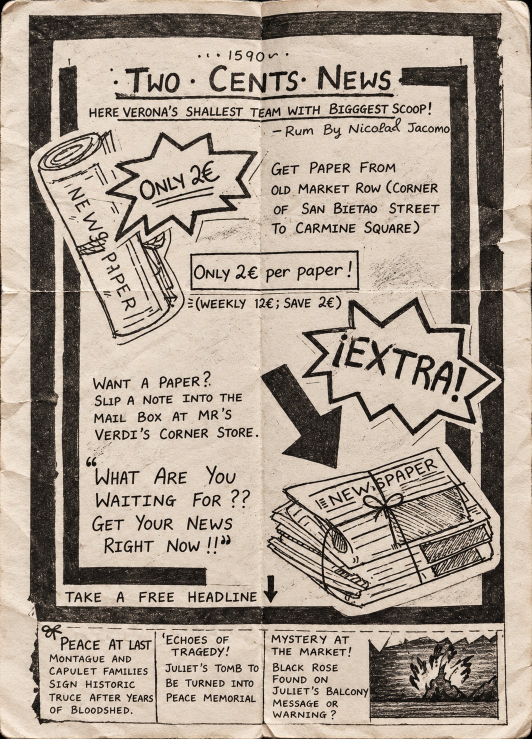
Romeo and Juliet and bring it to life. Meet
“Two Cents News”—Verona’s hottest (and
probably smallest) underground newspaper
from the 1590s.
Check out the full layout !
Extra, Extra! I made a 1590s
Newspaper for Romeo & Juliet
Newspaper for Romeo & Juliet
I wanted this to look like
an authentic, old-school
broadsheet flyer you’d
see pasted onto a stone
wall in Italy, so I went
entirely analog with black
ink and paper.
an authentic, old-school
broadsheet flyer you’d
see pasted onto a stone
wall in Italy, so I went
entirely analog with black
ink and paper.
I used heavy black borders,
bold hand-lettering, and
some clean
cross-hatching to give the
illustrations of the
newspaper bundles that
classic, woodblock-printed
vibe.
bold hand-lettering, and
some clean
cross-hatching to give the
illustrations of the
newspaper bundles that
classic, woodblock-printed
vibe.
To make the “EXTRA!” and
newspaper graphics pop, I
actually drew them
separately, cut them out, and
layered them onto the main
page to give the layout some
cool dimension.
newspaper graphics pop, I
actually drew them
separately, cut them out, and
layered them onto the main
page to give the layout some
cool dimension.
Style
collage Effect
Design