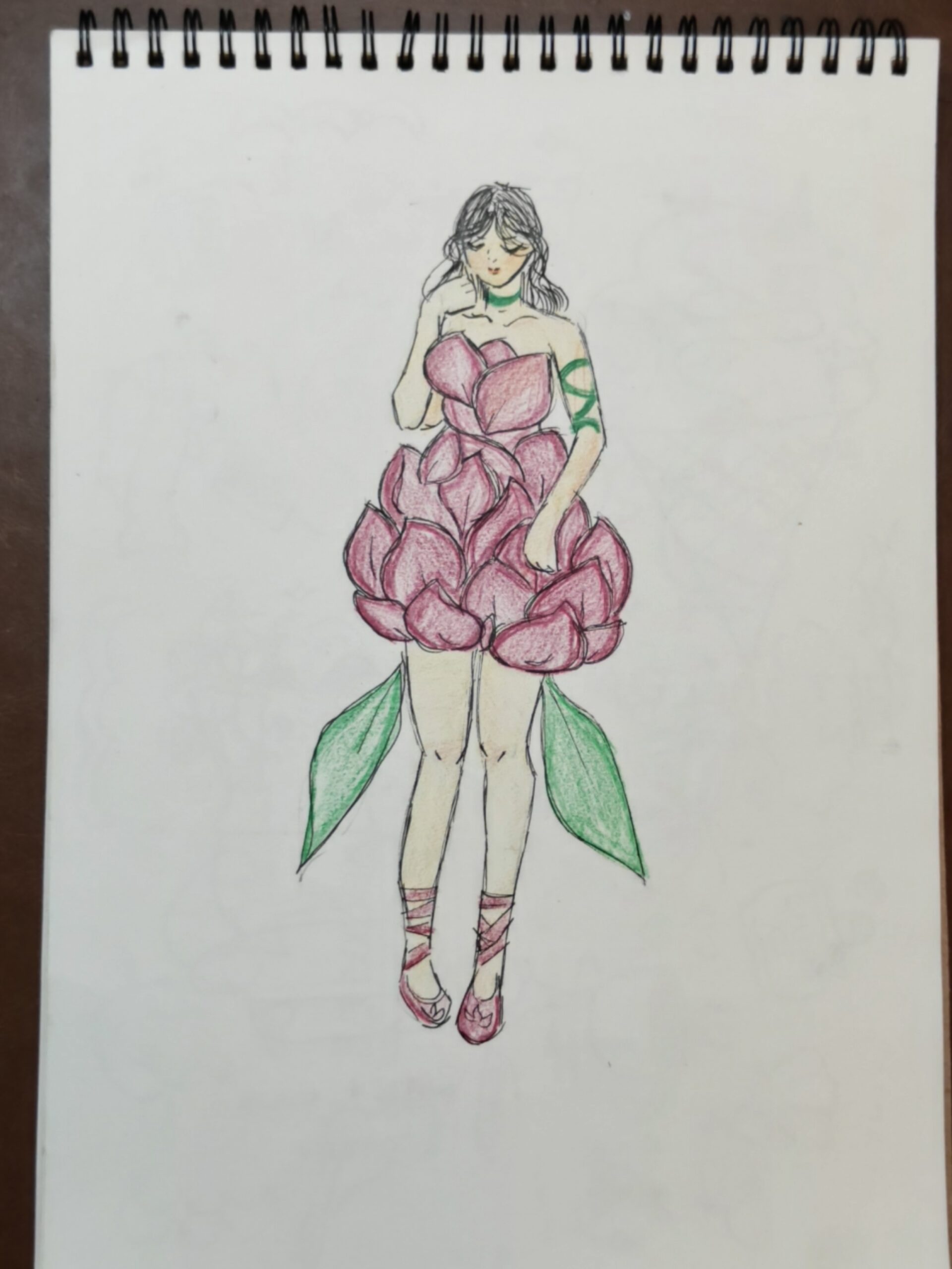
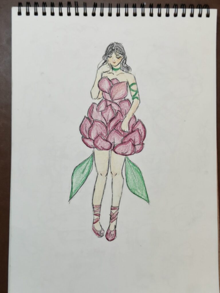
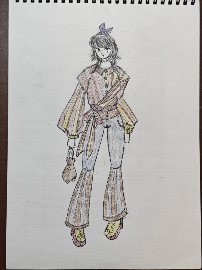
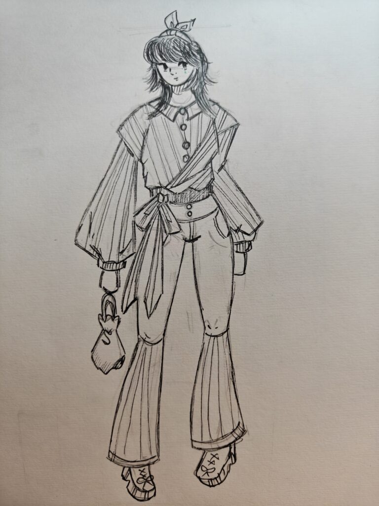
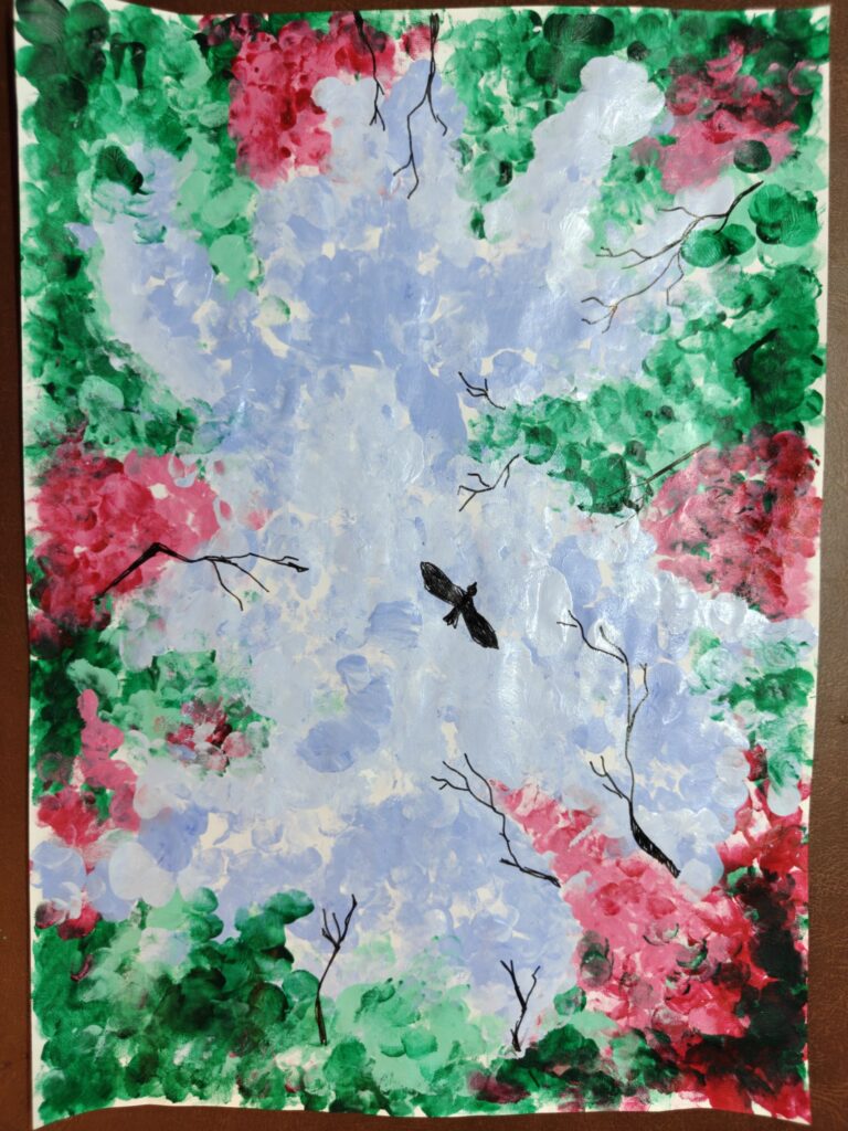
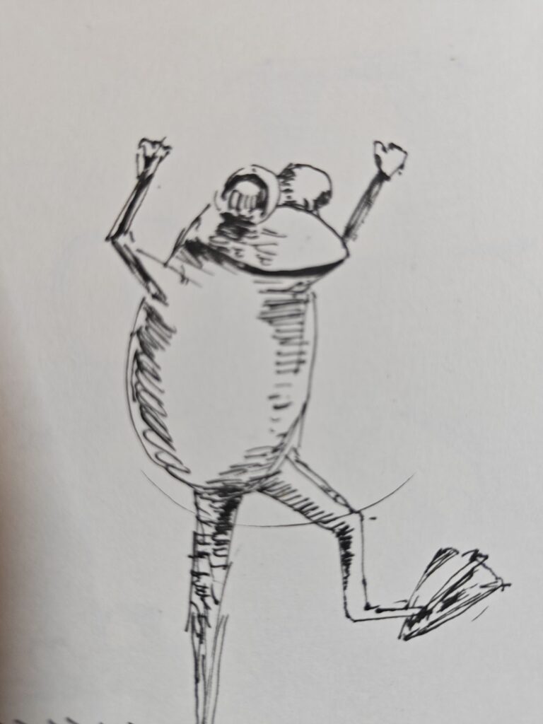
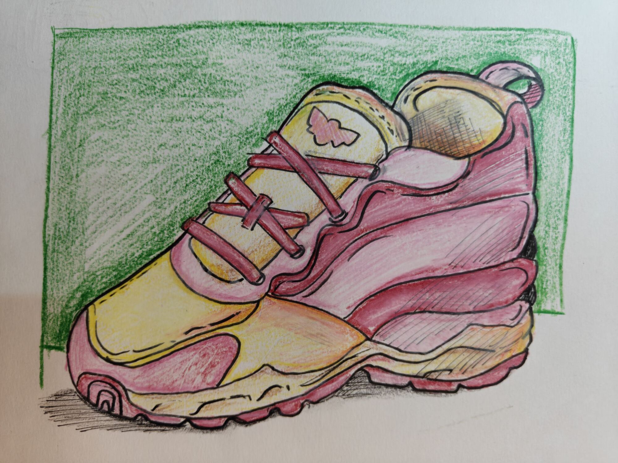
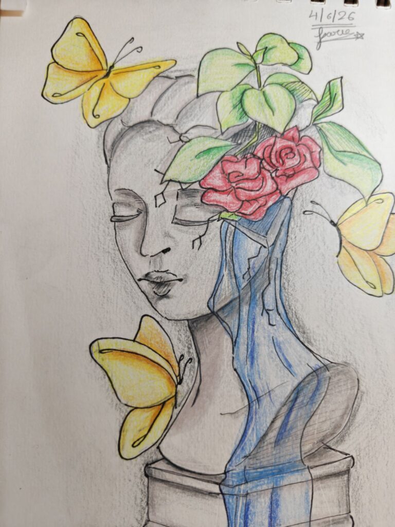
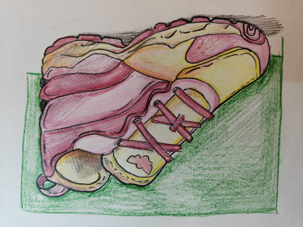
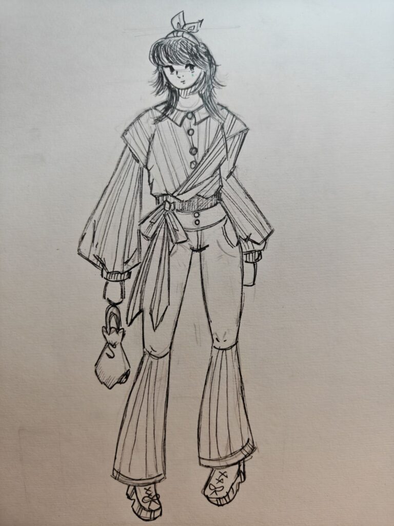
These sketches are part of an ongoing exploration of character design, fashion illustration, and visual storytelling. Each drawing begins with a simple idea and evolves through lines, shapes, textures, and color. From a flower-inspired dress to contemporary fashion concepts, these works reflect an interest in blending nature, clothing, and personality into unique visual characters.
Created using pencil, ink, and colored pencils, these sketches capture the joy of experimentation and the process of turning imagination into form. Every page is a step forward in understanding design, proportion, expression, and style.
Sketchbook explorations • Character Design • Fashion Illustration • Creative Practice ✨
Sketchbook Notes: Fashion, Form & ImaginationSketchbook Notes: Fashion, Form & Imagination
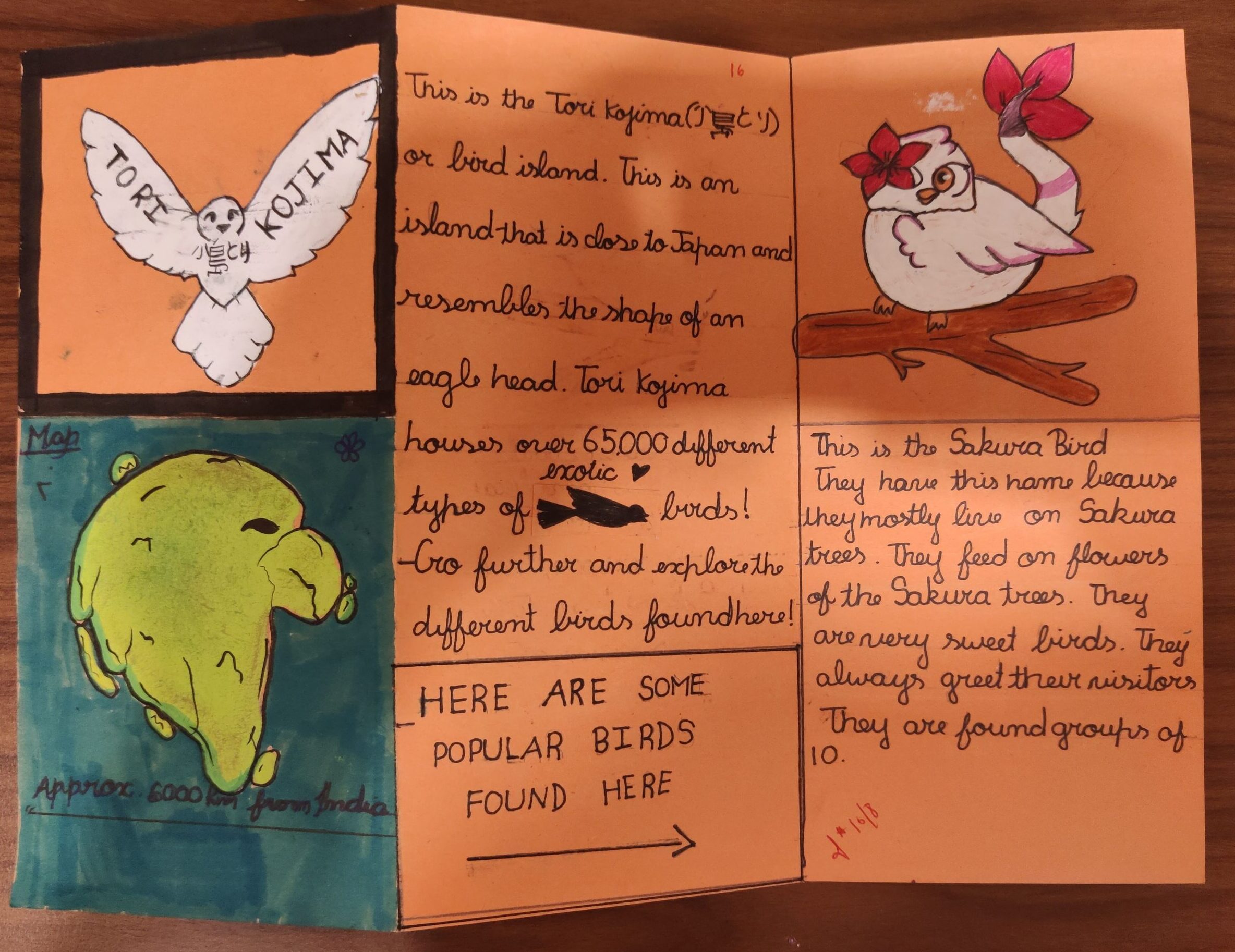
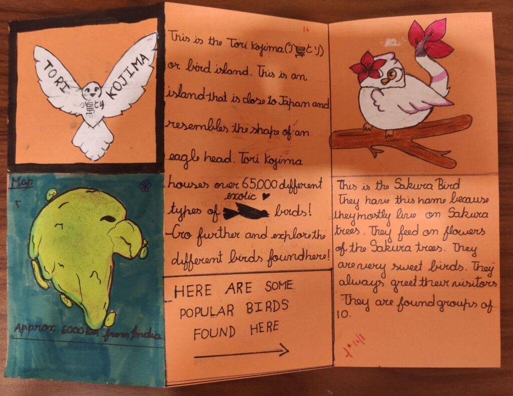
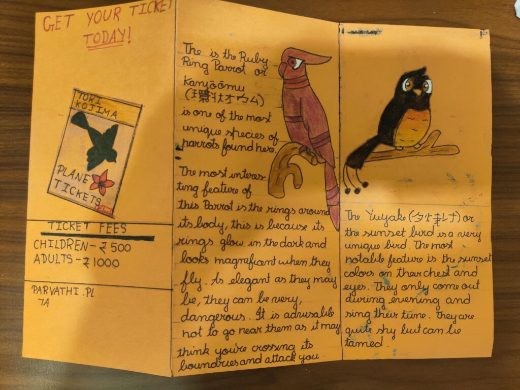
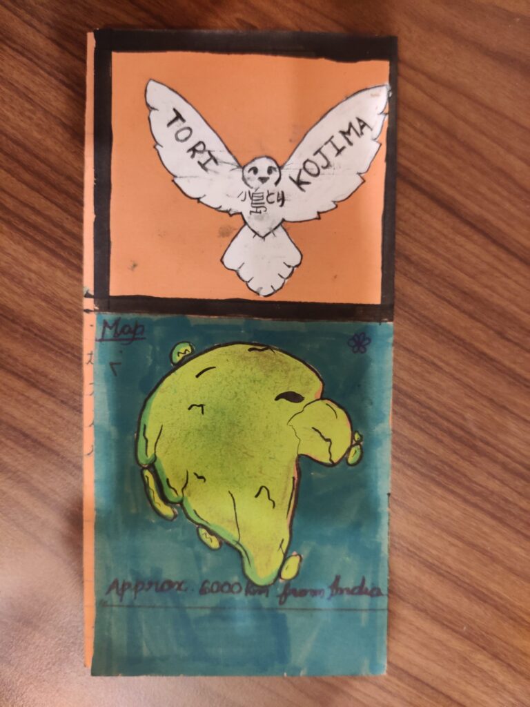
Three years ago, as a Grade 7 student, this creative project brought an imaginary destination to life — Tori Kojima (Bird Island). Designed as a hand-crafted foldout brochure, it combines storytelling, illustration, map-making, character design, and information design into a playful travel experience.
The project introduces readers to a fictional island filled with unique bird species, complete with a custom island map, ticket design, and colorful bird characters such as the Sakura Bird, Ruby-Ring Parrot, and Yuyake Bird. Every page reflects curiosity, imagination, and an early interest in visual communication.
Looking back, this project is a wonderful reminder that design begins with observation, creativity, and the courage to invent new worlds. It represents an important milestone in a young designer’s journey and showcases how storytelling and illustration can work together to engage an audience.
Brochure project BrochureBrochure
Created as a school project in Grade 7 (2023). Medium: Hand-drawn illustrations, marker rendering, and handmade brochure design.
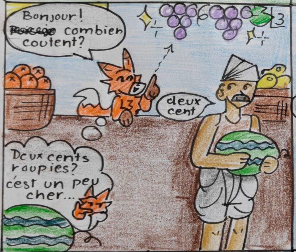
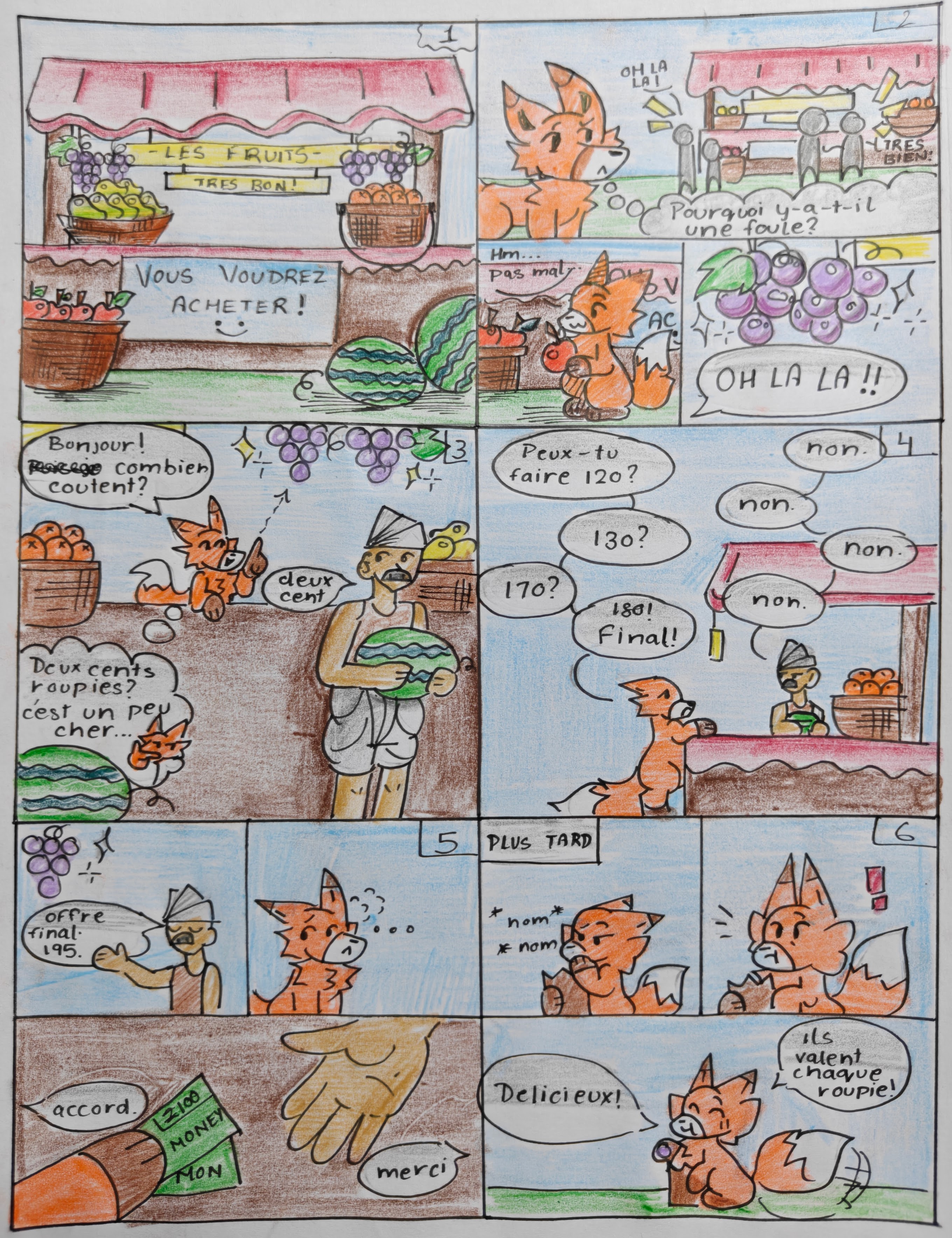
The Fox and the Grapes story (modern version!) made into a 6-frame Storyboard.
Par un bel après-midi d’été, un magasin de fruits animé se trouvait à l’angle d’une rue très fréquentée. La boutique était célèbre non seulement pour la qualité de ses fruits, mais aussi pour la manière artistique dont ils étaient présentés.
Le commerçant avait disposé les fruits comme un peintre composant un chef-d’œuvre.
Des mangues dorées étaient empilées en pyramides parfaites. Des pommes rouges brillaient sous les rayons du soleil. Des oranges formaient de jolis cercles dans des paniers en osier. Des pastèques reposaient à l’entrée comme de grands géants verts.
Et, suspendues à un support en bois au centre du magasin, se trouvaient de magnifiques grappes de raisins.
Les raisins semblaient irrésistibles. Leur peau violette et brillante ressemblait à des pierres précieuses polies. De minuscules gouttes d’eau scintillaient à leur surface, les rendant encore plus appétissants.
De nombreux clients s’arrêtaient pour les admirer.
À ce moment-là, un renard entra dans le marché.
En s’approchant du magasin, ses yeux s’agrandirent.
« Quelle présentation magnifique ! » dit-il.
Le renard fit lentement le tour de la boutique, examinant chaque fruit.
« Ces mangues ont l’air délicieuses. »
Il les huma.
« Et ces pommes sentent merveilleusement bon. »
Puis son regard se posa sur les raisins.
Il s’immobilisa.
« Oh là là ! » s’exclama-t-il. « Regardez ces raisins ! Ce sont les plus beaux raisins que j’aie jamais vus. »
La bouche du renard se remplit d’eau.
« Il faut absolument que j’en achète. »
Il s’avança avec assurance vers le comptoir.
Le commerçant sourit.
« Bonjour, monsieur. Puis-je vous aider ? »
Le renard désigna les raisins.
« Oui, bien sûr. Ils ont l’air délicieux. Combien coûtent-ils ? »
Le commerçant répondit :
« Deux cents roupies le kilo. »
« Deux cents roupies le kilo ? » répéta le renard.
« Oui, » répondit fermement le commerçant. « Ce sont des raisins de qualité supérieure. »
Le renard fronça légèrement les sourcils.
« Hmm… c’est un peu cher. »
Le marchandage commença.
« Que diriez-vous de cent vingt roupies le kilo ? »
Whether you’re doodling in a notebook, sketching a concept for a client, or creating a detailed illustration, sketching is often the first step in turning imagination into reality. It’s not about perfection—it’s about exploration, creativity, and storytelling.
Why Sketching Matters
Sketching is the visual equivalent of brainstorming. It allows artists to quickly capture ideas, experiment with compositions, and solve creative challenges before investing time in a final piece.
Some benefits of sketching include:
Improving observation skills
Developing hand-eye coordination
Exploring concepts freely
Building confidence as an artist
Strengthening creative thinking
The best part? You don’t need expensive tools to start. A pencil and paper are enough.
From Sketch to Illustration
A sketch is often the foundation of an illustration.
While sketches focus on structure and ideas, illustrations bring those ideas to life through detail, color, texture, and personality. From children’s books and editorial artwork to branding and digital art, illustration transforms simple concepts into engaging visual stories.
Think of it this way:
✏️ Sketching = Planning the journey 🎨 Illustration = Bringing the destination to life
Fun Sketching Exercises
Want to improve your skills? Try these creative exercises:
1. One-Minute Sketches
Set a timer and sketch everyday objects in just one minute. This helps train your eye to focus on essential shapes and forms.
2. Draw Without Looking
Try drawing an object without looking at your paper. The results may be funny, but it’s a fantastic exercise for observation.
3. Create Character Expressions
Draw the same character showing different emotions—happy, surprised, confused, excited, or sleepy.
4. Everyday Illustration Challenge
Choose a common object, like a coffee mug or backpack, and turn it into a unique illustrated character.
Embrace Imperfection
One of the biggest misconceptions about art is that every drawing needs to be perfect. In reality, sketchbooks are meant for experimentation, mistakes, and growth.
Every rough line teaches something. Every unfinished sketch builds confidence. Every drawing is a step forward.
Final Thoughts
Illustration and sketching are more than artistic skills—they’re powerful tools for communication and creativity. They help us visualize ideas, tell stories, and see the world from new perspectives.
So pick up a pencil, open a sketchbook, and start creating. Your next great idea might begin with a single line.
Do you prefer traditional sketching or digital illustration? Share your favorite tools and techniques in the comments below! ✨
Hex colors are one of the most common ways to define colors on the web. They use a six-character code made up of numbers (0–9) and letters (A–F) to represent the intensity of red, green, and blue.
For example:
#FF0000 – Red
#00FF00 – Green
#0000FF – Blue
#FFFFFF – White
#000000 – Black
Each pair of characters represents a color channel:
Red:#RR
Green:#GG
Blue:#BB
So the color #FF6B57 contains:
Red: FF (255)
Green: 6B (107)
Blue: 57 (87)
Designers often create a small palette to keep projects visually consistent. A sample palette might include:
Purpose
Hex Code
Primary
#FF6B57
Background
#FAF7F0
Text
#222222
Highlight
#FFE08A
Secondary Text
#666666
When choosing colors, it’s important to maintain sufficient contrast for readability and accessibility. Dark text on a light background is generally easier to read, while accent colors should be used sparingly to draw attention without overwhelming the design.
Understanding hex colors is a fundamental skill for anyone working in web design, branding, illustration, or digital product development.
Extra, Extra! I made a 1590s Newspaper for Romeo & Juliet
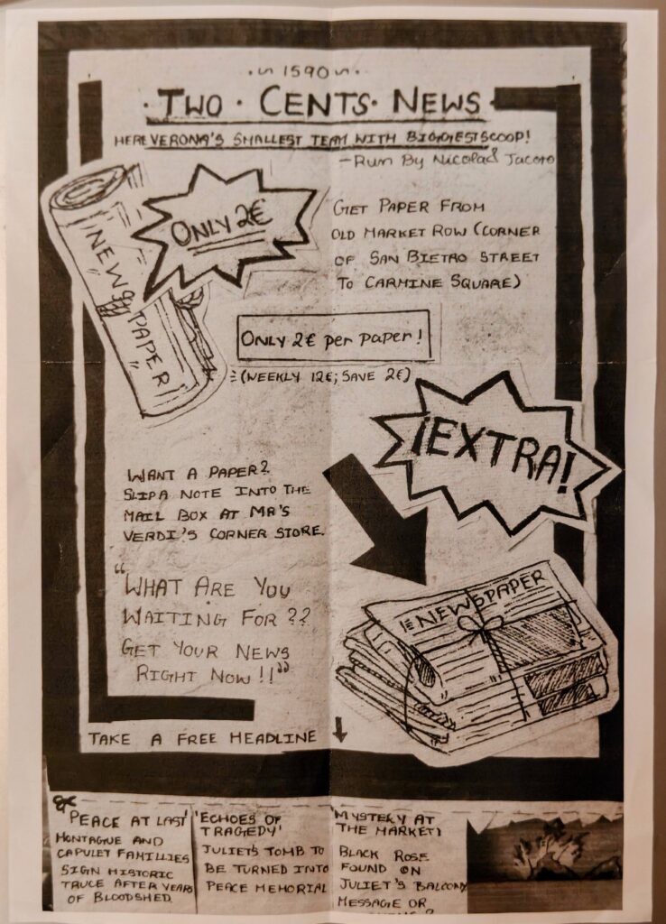
So for our latest project, I decided to do a massive deep-dive into the aftermath of Romeo and Juliet and bring it to life. Meet “Two Cents News”—Verona’s hottest (and probably smallest) underground newspaper from the 1590s.
Check out the full layout !
Two Cents News
The Design
I wanted this to look like an authentic, old-school broadsheet flyer you’d see pasted onto a stone wall in Italy, so I went entirely analog with black ink and paper.
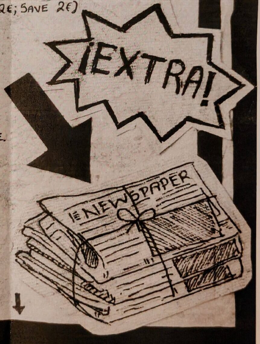
The Style: I used heavy black borders, bold hand-lettering, and some clean cross-hatching to give the illustrations of the newspaper bundles that classic, woodblock-printed vibe.
The Collage Effect: To make the “EXTRA!” and newspaper graphics pop, I actually drew them separately, cut them out, and layered them onto the main page to give the layout some cool dimension.